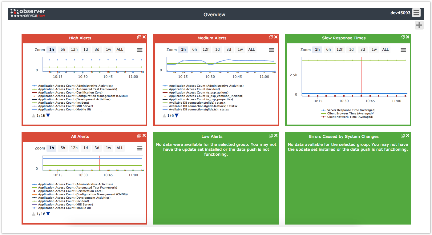
After logging into Observer, you will be directed to the Overview page. The Overview page displays various trend group charts that have aggregated data from your ServiceNow instance in real time (NOTE: Times on x-axes for trend group charts are shown in military time).
Trend group charts highlighted in red are displaying metrics with a high number of alerts that may need your attention. Trend group charts highlighted in green are displaying metrics with a low number of alerts that do not need your attention. If no metrics are available from your ServiceNow instance, the trend group chart will be blank.
Drag and drop trend group charts
The trend group charts on your Overview page will be arranged by default in the order shown below but can easily be moved around by dragging and dropping.
Change zoom intervals for trend group charts
The zoom interval indicates an interval of time for which collected data from ServiceNow is displayed in an Observer trend group chart. To change the zoom interval for a trend group chart, click any of the zoom interval buttons (1h, 6h, 12h, 1d, 3d, or 1w). For more information about zoom intervals, see change the zoom interval for a trend group chart.
Scroll through trend group chart metrics
To scroll through the metrics for a trend group chart, click ![]() or
or ![]() within that trend group chart.
within that trend group chart.
Overview page topics
View trend group chart details